How to make an AI-built website not look AI generated
A member on Friday’s Build with Brad call had just finished his own site with AI. He’d used Impeccable, and it still had some signals of that AI scent. He asked how to make his sites look less vibe coded.
That’s the difference between AI slop designs and quality work that’s human-directed. And for me it comes down to a style guide, before any page gets built.
If you haven’t used it: Impeccable is a set of design skills you add to Claude Code. You get commands like shape, which plans a design before any code gets written, critique, which reviews what you’ve built and says what’s wrong, and polish, a final pass before you ship. I basically always use it, right from the beginning.
Impeccable will do really polished AI slop
Impeccable will do a really polished AI slop if you don’t give it better input before anything happens. It’ll be really perfect. It’ll be like, wow, this is the best version of an AI website. But if you guide it before that with an actual style guide, you get something else.
If you don’t direct it, it’ll invent it. It’s easier to fix a style guide and reshape a style guide than it is to reshape a whole website that’s wide open. It’ll just invent and fill in blanks.
Start with what you’ve already got
My website was fully coded by Claude Code. But it went through my taste filter first. I had an actual Figma file with the design guide. I did the typography, I did all the colors, and I named them: Igloo White, Canola Delight, Hockey Puck, Lake Louise Azure. Very Canadian references. In Saskatchewan, where we have our cabin, there’s canola fields everywhere, and it’s yellow. I had the logo I designed, and the style.
- Igloo White#FFFFFF
- Canola Delight#FFCA00
- Hockey Puck#010101
- Lake Louise Azure#56CCF2
So I had a good reference point. I spun up Claude Code, dropped in the Figma file (or connect Figma through an MCP, whatever works) and used Impeccable.
I said here’s my main colors, here’s the main style, here’s the font I want to use. I had some rough mockups. But instead of saying “now make a website,” I said, let’s make a style guide with all the components tokenized. From buttons to inputs to the cursor. The way a chart appears, a toggle switch, small text, big text, cards, light mode, dark mode. I use lots of flowcharts to show how we do our work, so those too. I made as many things as possible to say: here’s the style guide.
Then when we do the site, the site follows the conventions. It knows the tokens. If I need to change a style, I change the style guide, and everything’s a variable based off of it. I change a color or a button size, it’s everywhere. It’s not “let’s create new stuff on the site.”
Same thing for a Shopify store
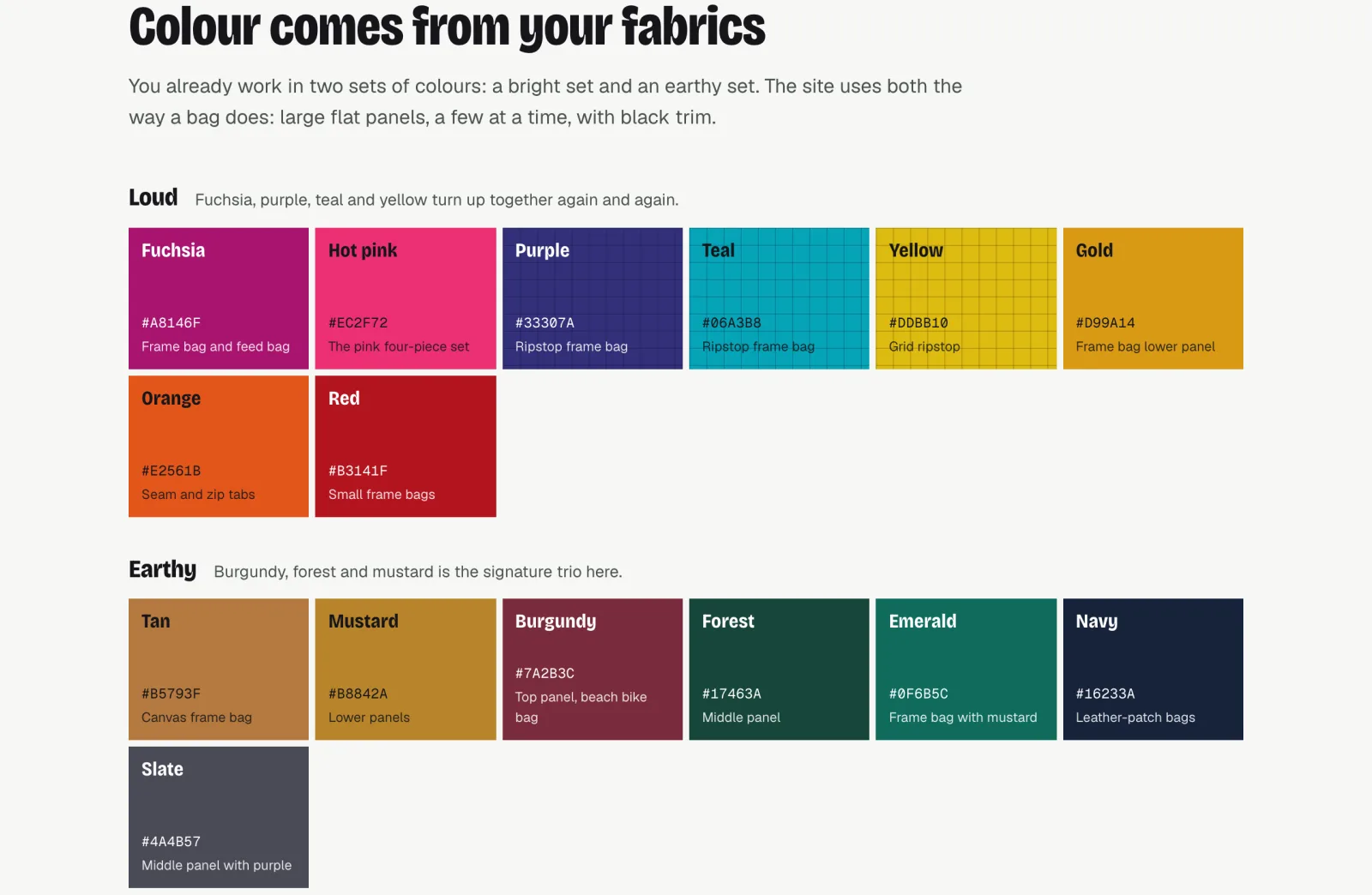
We just shipped one for my brother’s company, Wild North Gear. He makes custom bike frame bags, and he has a really unique artistic style. It’s really retro, kind of 80s, 90s. His colors weren’t invented. They came literally off his fabrics. We used the cutting grid he has on his workshop bench, and the tactile material.
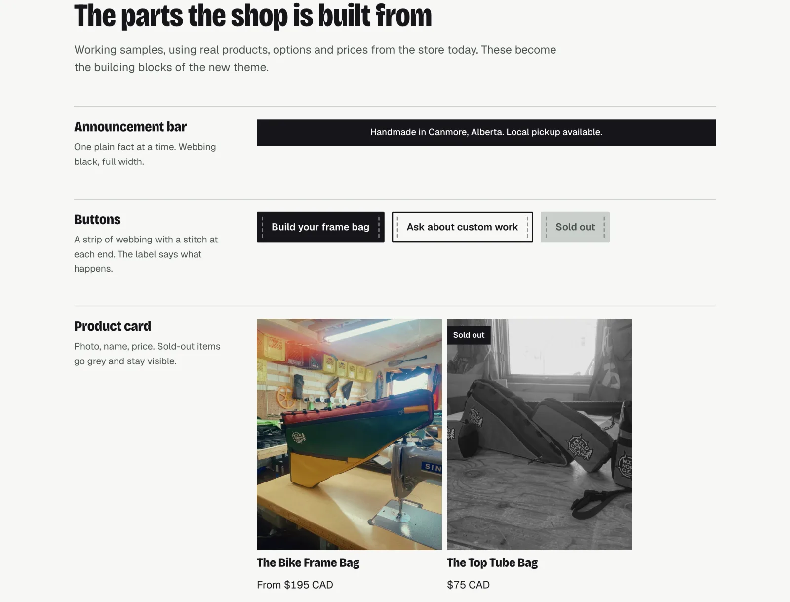
So I established a brand style guide first. How the logo lockup works in different frames, do’s and don’ts, all the colors, the typography, how to display photos with alt text. Even the language: copy examples, what to say, what not to say. From buttons to “sold out,” all the components for a Shopify theme. Then we built the Shopify theme off it.
How to start one from your own site
On the call I did a rough demo using his site. I opened Claude Code in my terminal and dictated a prompt. Here’s a cleaned-up version you can copy. Swap in your own URL.
I want a style guide for my website before we build or change any pages. My current site is [your URL].
- Analyze the site: colors, fonts, spacing, buttons, cards and other components.
- Ask me questions until you’re about 95% confident in the direction. How far should it move from what’s there now? How should it feel to a buyer? What has to stay? Don’t fill gaps with generic choices.
- Use Impeccable to shape the direction. Keep what works. Improve the colors, the color theory and the typography, and anything that looks generic, template-made or AI-generated.
- Tokenize everything: colors, type, spacing, corners, buttons, inputs, cards, light mode and dark mode. Every page we build later uses these tokens, not new values.
- Give me one HTML file I can open in my browser with the core tokens, the components and a sample hero section using my real copy.
Don’t change the live site. This style guide is the source of truth we build from.
On a real project I’d also give it reference files: the logo, the colors I’ve already picked, a Figma file if there is one.
It asked how far the style guide should move from the current brand: evolve it, reinvent it, or evolve plus one bold alternative. He wanted to stay conservative, so evolve. What should it feel like to a buyer? He wanted it dialed back, poised and professional, so premium and calm. We kept his copy as is, since he’s done the work on that. And for the page itself: core tokens, components and a sample hero section.
A few minutes later it had a design system page. The colors and how much of each to use, the typography, components, spacing and corners, the principles, and quite literally the CSS tokens. So any time it’s building something, it has them.
And because you have this, you can go: I don’t want rounded corners. No drop shadows. These buttons need to be pill-shaped. You work on the components. You work on the source of truth and get it right before assets are created. Pages, blog posts, content, all that.
Then I’d use Impeccable further. Impeccable polish, give me some variations on this, let’s try this. It’ll critique the design and suggest things, and we work from there. When I’m done, I commit it.
That was a demo. If I was working on this as a client project, I’d probably spend the rest of the day shaping it, getting feedback from the client, and really dialing it in.
Then use it for everything
Whether you’re improving the site, adding more materials, or you want Instagram graphics, LinkedIn graphics, ads, you always reference the style guide. It’s not going off some other loose reference point. This is the source of truth. Create the graphic, create the ad, create the new component based off of it, rather than some loose website example.
Taste is the part you practice
Find reference points you really love. Good old-fashioned design inspiration. On the call we went through Land-book and filtered by landing page and agency. I like inspiration from totally different industries.
You could say: I love this. Don’t copy it, but what of this site can we borrow that isn’t going to be too out of the ordinary, but could add some delight to our style guide? Or: I love that font, I want it as my primary font, and we’ll build around that with our own colors.
That’s where the taste comes in. You practice that part, rather than being bogged down by the technical implementation of it.
And learn the language. Graphic design books, logo design books. You learn the language of what works, so when you’re directing something, you’ll know how to speak it. That’s part of the difference between good output with AI and bad output. If you understand typography settings or design language, you’ll get better output.
Learn it as a language, rather than how to open up Adobe Illustrator and create really smooth lines. There are people who do that, and that’s fine. You don’t have to be one. But you could know how to communicate it.